In this article
Recognizing CORPO
I want you to recognize CORPO in an ordinary scene, even without the logo. Getting there means making choices about what belongs in this world.
I use AI to make CORPO's artwork, but I still have to decide what belongs in the picture and whether it works. A beautiful scene can be completely wrong for the game. The character can look wrong. The building can be in the wrong state. The action can disappear the moment the interface crops the image.
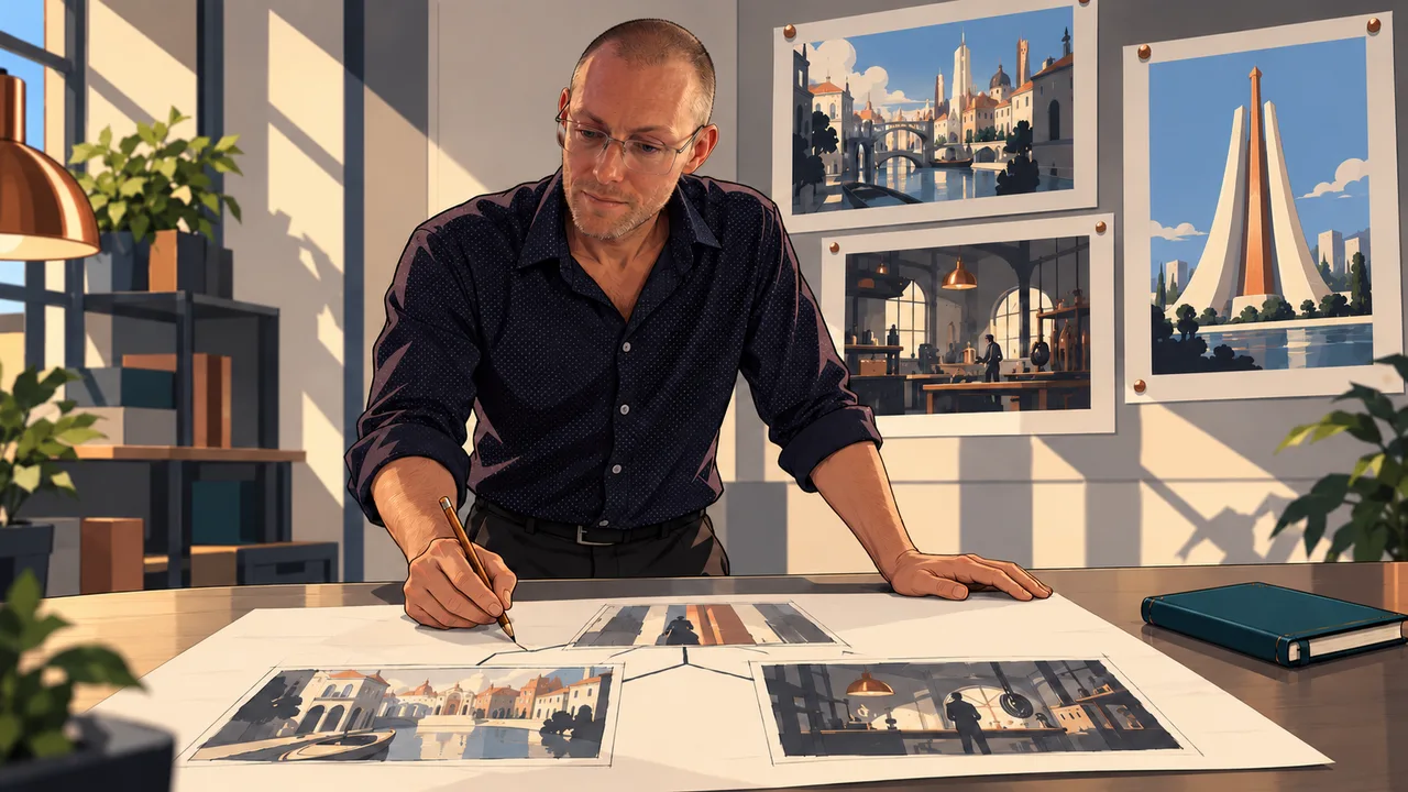
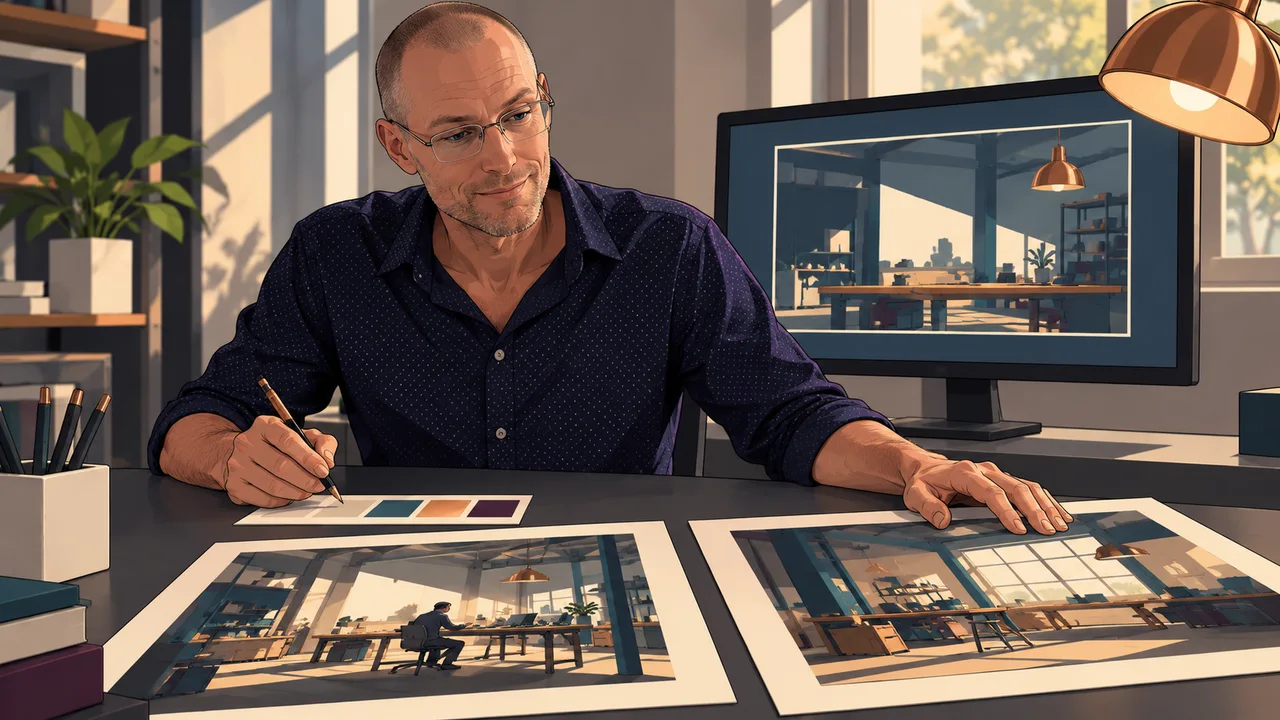
CORPO's visual direction is a mature, simplified graphic novel. Clear silhouettes, controlled contours and large matte shapes do most of the work. The lighting should make sense in the room. I want enough detail to understand the place without turning every wall into a collection of tiny sci-fi parts.
Keep the people recognizable
Aya has an adult face, a black bob, a plum coat and a white blouse. Anna has her ivory-and-copper head, single violet-ring optic and petrol vest. Those are established identities. A new scene needs to preserve them, even if the angle, pose or lighting changes.
The references have separate jobs. A portrait establishes who the character is. A successful scene shows how CORPO is rendered. A location reference establishes the architecture. Giving an image generator those specific references is much more useful than expecting the word CORPO to explain the whole project.
I apply the same discipline to the machines. Removing a servo's broadcast assembly matters because it shows that it has become an independent synth. Replacing that with a random glowing robot detail would make the image less accurate, however polished it looked.
The room has to make sense
Some of the most useful corrections have been very ordinary. In one command-room scene, overlapping props made the interaction physically confusing. The correction used a solid table, supported hands and a few large model blocks. Now the characters have something clear to discuss, and their hands have somewhere to go.
A cleared clinic needed another kind of correction. The scene had to remain a damaged place awaiting further work, so the lamp stayed off. A nearby wall, broken cabinet and torn curtain told that story more clearly than an expansive view outside. Clearing a site doesn't magically repair it.
An Airlink scene had a similar problem. Removing a sunset skyline and showing the service wall, connectors and disconnected cable made the unfinished work visible. The illustration needed to show what had happened at that point in the game. A dramatic background couldn't do that job for it.
The phone crop
The full illustration is only part of the review. A book was visible in the source art for a handoff and reading sequence, then disappeared in a short landscape phone crop. That is a fairly major problem when the scene is about the book.
I need to see the important object and the character's face together, with the dialogue in place. Seated and kneeling characters make this especially obvious. A speech bubble can fit perfectly on the screen while covering the person who's supposed to be speaking.
Sometimes the fix is a better crop or a different bubble position. Sometimes the composition needs to change. I want the smallest correction that solves the actual problem while preserving what already works. Generating another image isn't automatically progress.
Bring the same world into the wiki
The wiki should look like it belongs to CORPO. That starts with the current Tower mark, the game's visual references and the actual illustrations. The Tower keeps its taller copper center and two ivory flanks. It shouldn't turn into a different piece of architecture every time it appears.
I want the interface to leave room for the art. A location marker should feel familiar from the game. A title should tell you what you're looking at. I asked to remove labels like story brief and the decorative punctuation. They were getting in the way of the pictures.
Motion has to respect the scene too. A small camera move can work on a complete illustration. Separate character movement needs proper layers and believable contact with the environment. If a hand is resting on a table, it needs to stay on the table. And when motion is turned off, the page still needs to work.

I’m the solo creator of CORPO. I want to teach business and independence through a game worth playing.
 Why I’m making it